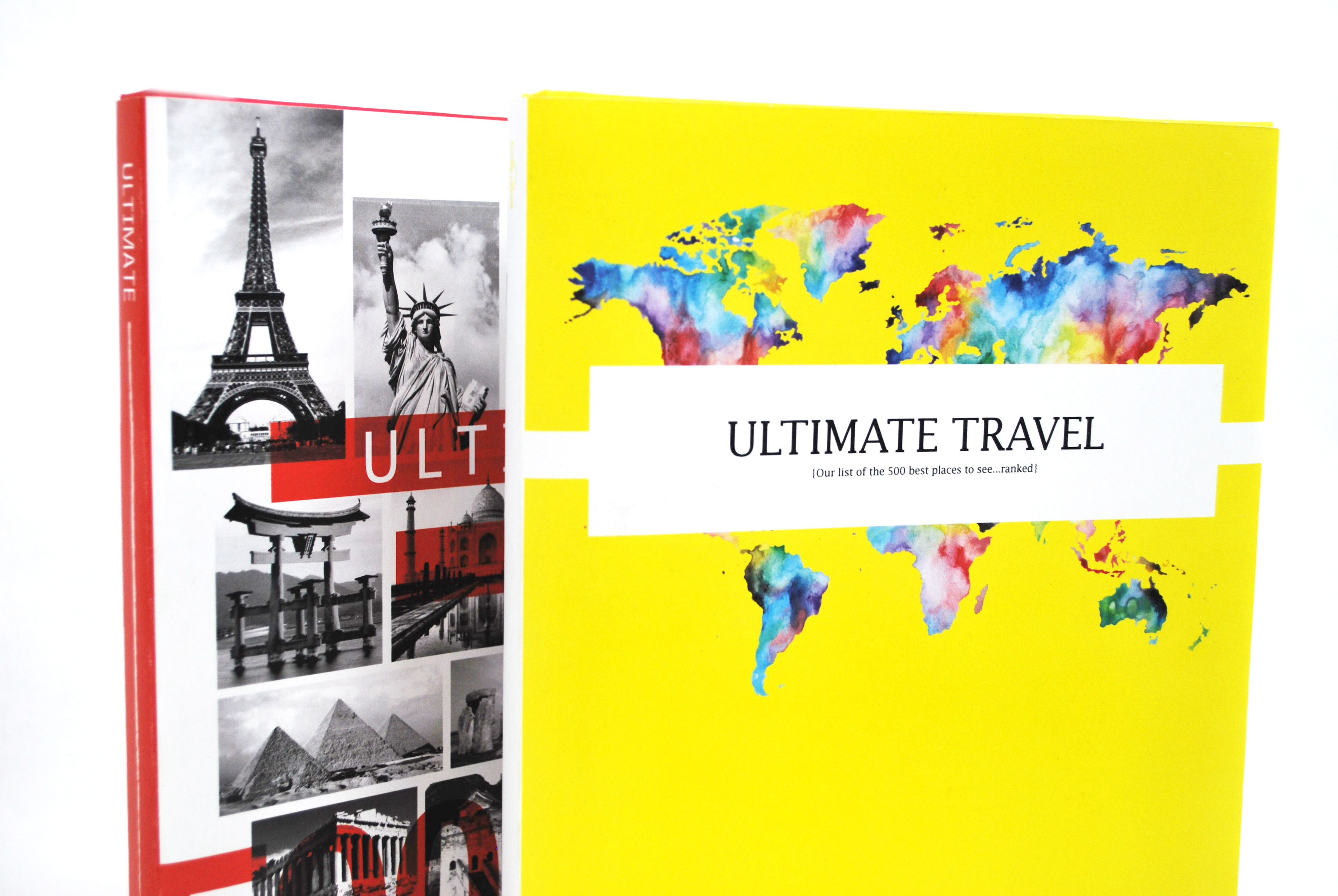
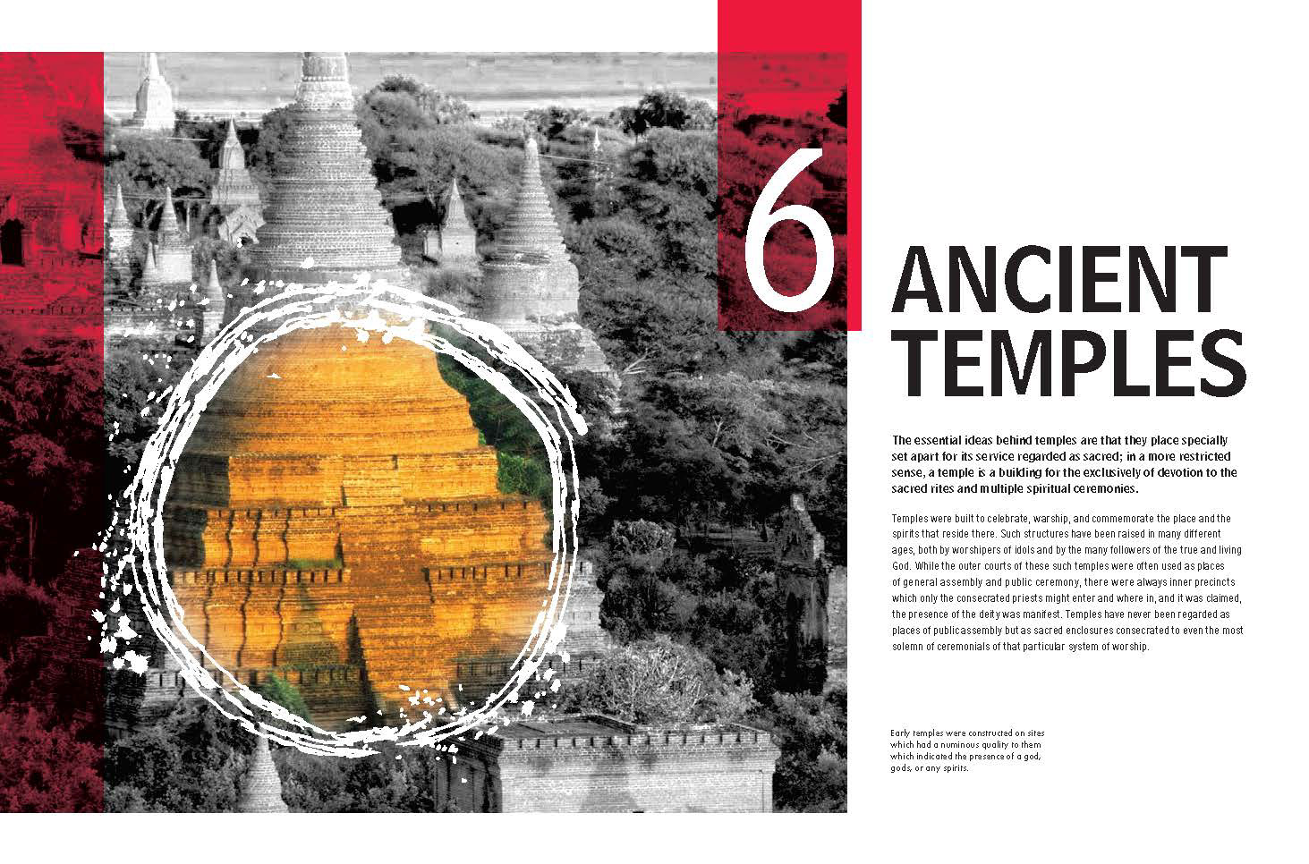
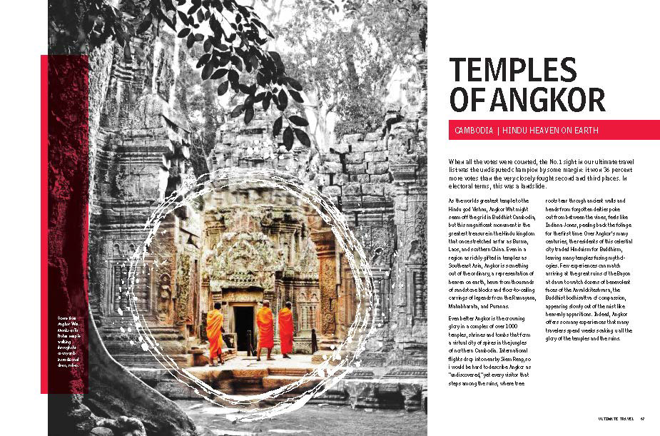
When I think of travel I envision mystery and adventure. Most travel books are filled with extravagant photography that leave the user satisfied with what they have learned about the destination. For this design, I wanted to create an experience that leaves the user wanting more. The highlighting of focal points with in each image contrasts with the remaining gray-scale image to create a sense of mystery and curiosity. This creates a sensation of mystery that encourags the user to explore further beyond the book and resarch more about their desired destination. This sensation creates an experience for the user to immerse themselves in the mystery of travel and encourages a desire for adventure and exploration.
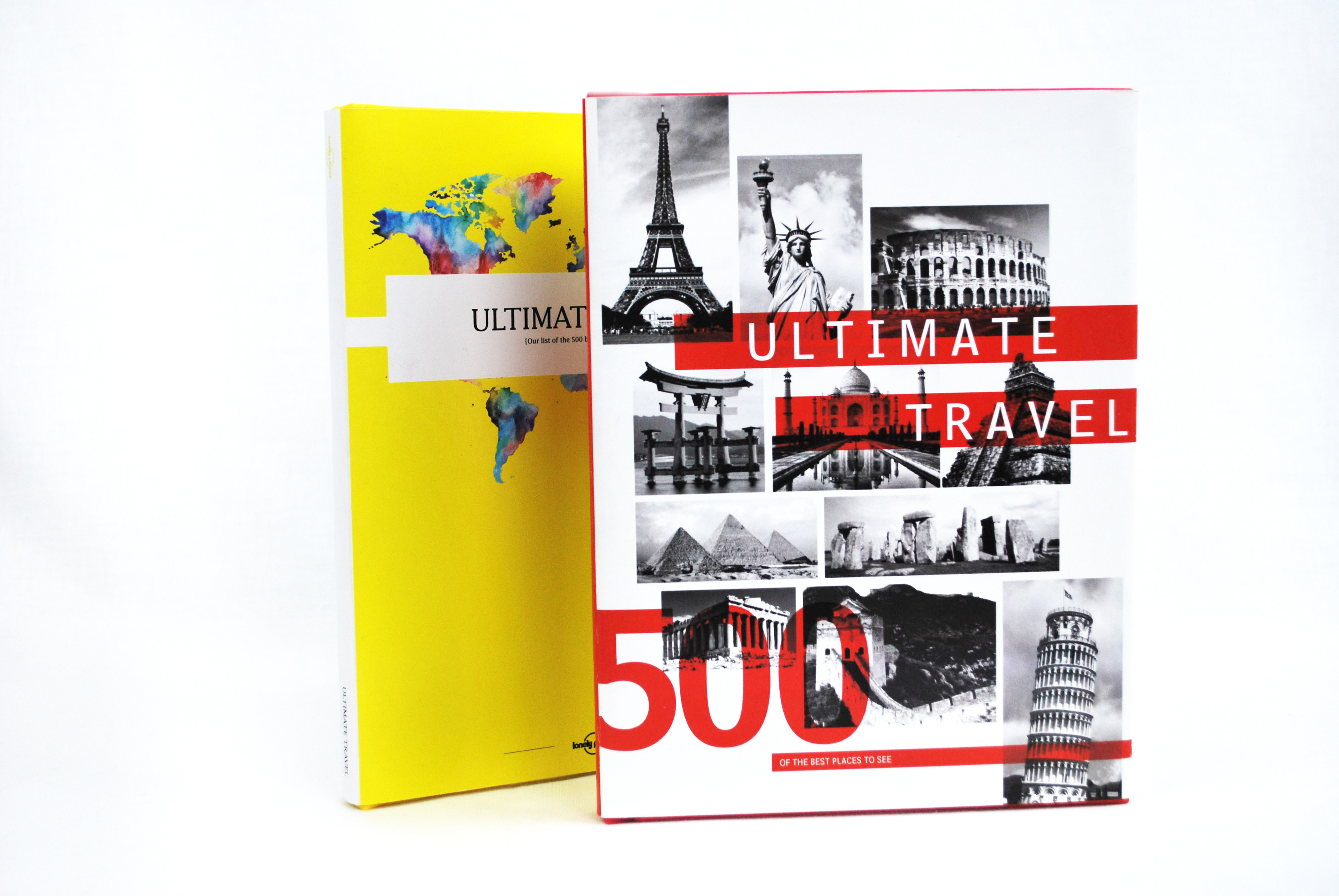
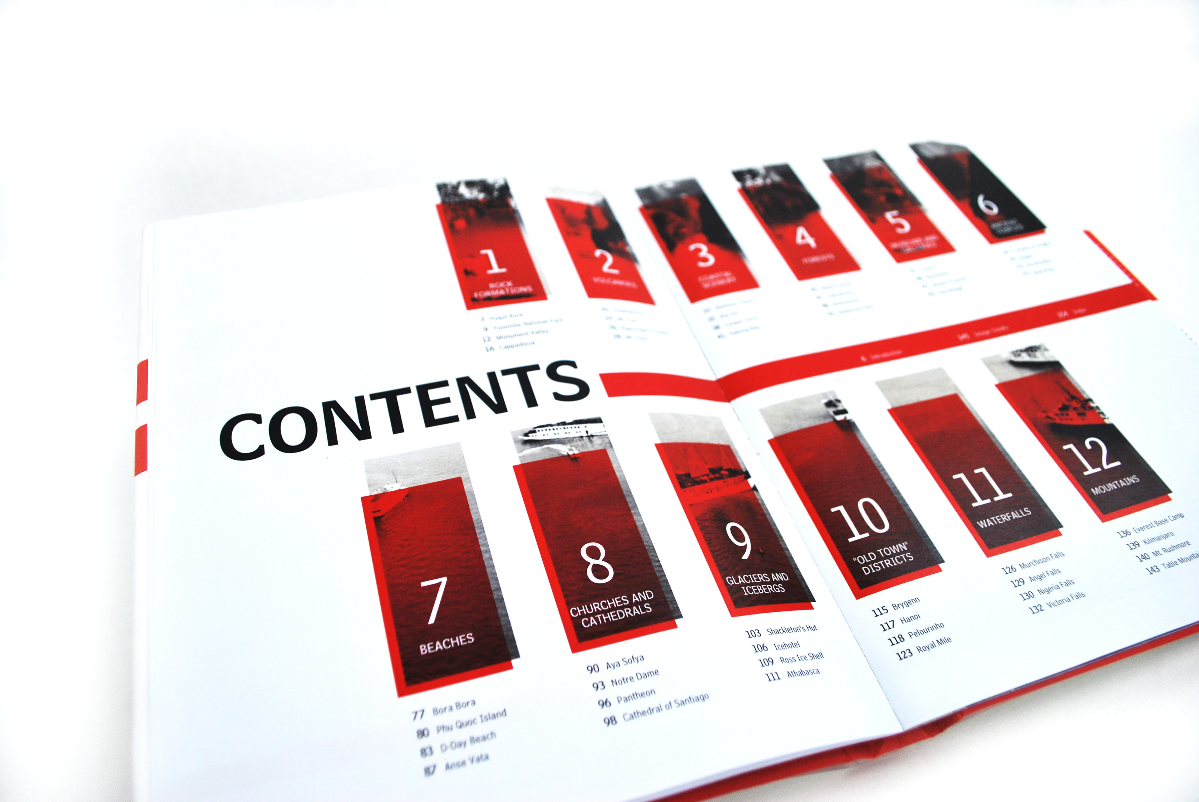
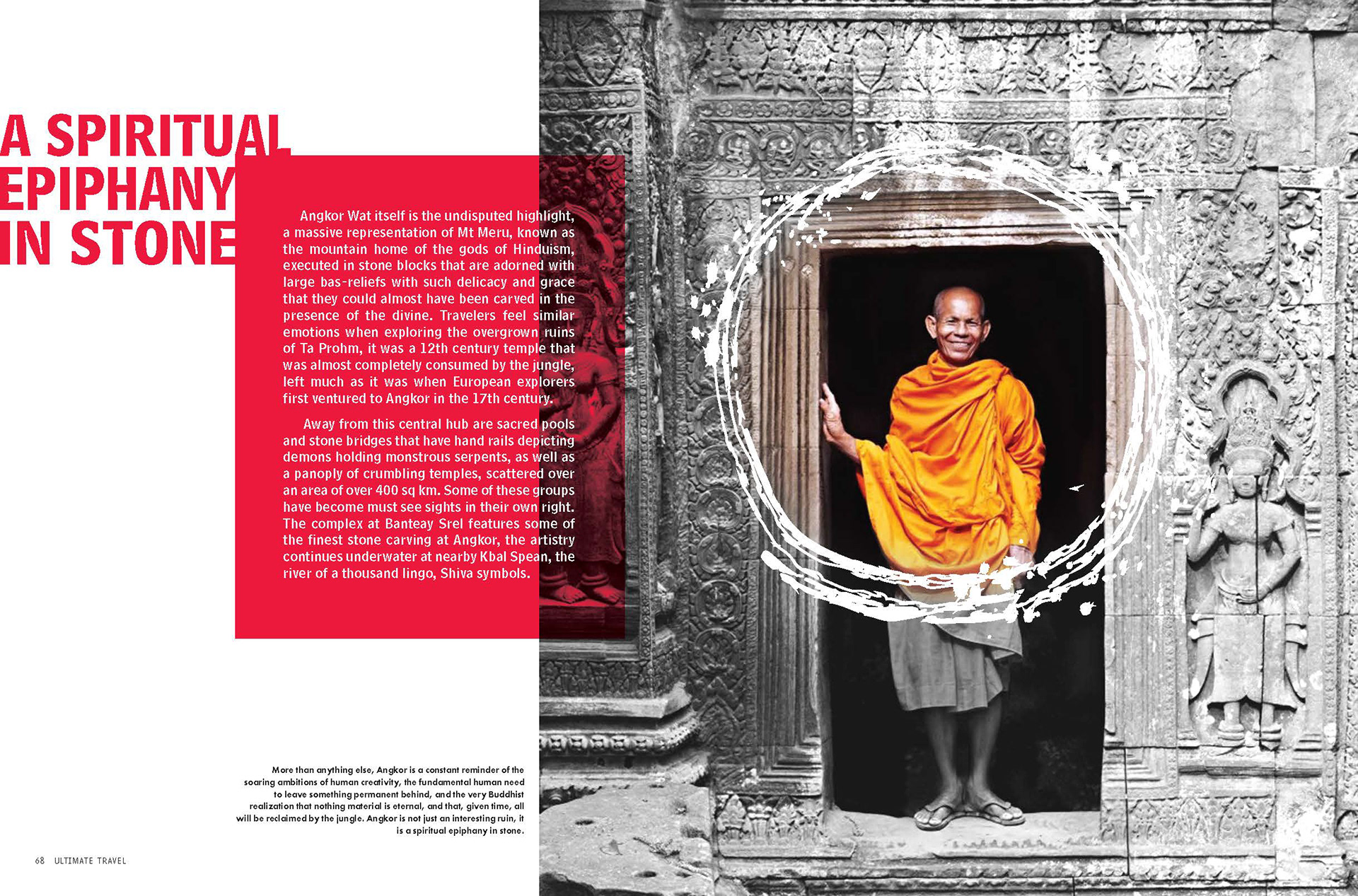
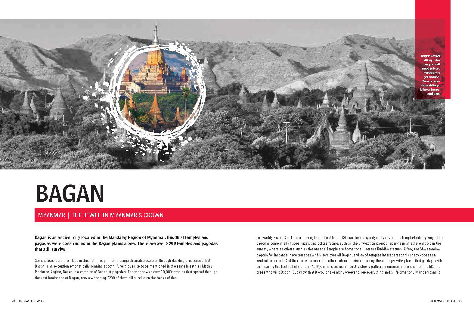
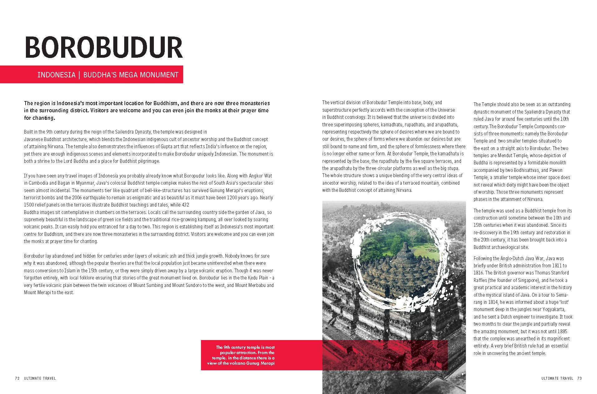
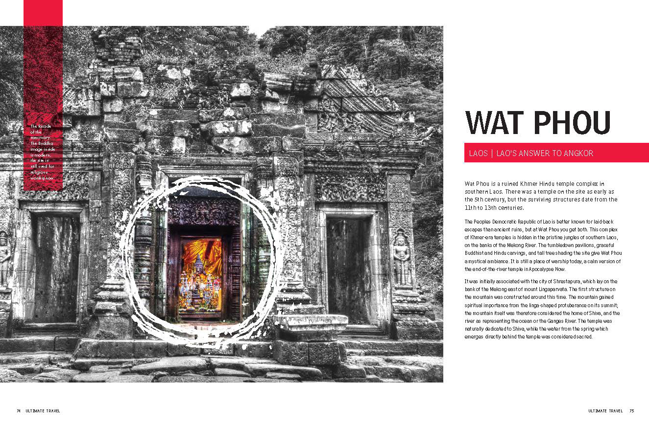
For this design I wanted to create a clean layout that balances both the image and the typography. I explored experimental methods of typography as a balance to the full color images. I wanted to retain the sensation of adventure and exploration through a more minimal approach. The experimentation of typography breaks the norm and reflects the playful aspects of adventure. The minimized full color images inflict the sense of exploration while still leaving the user with the desire of wanting more.