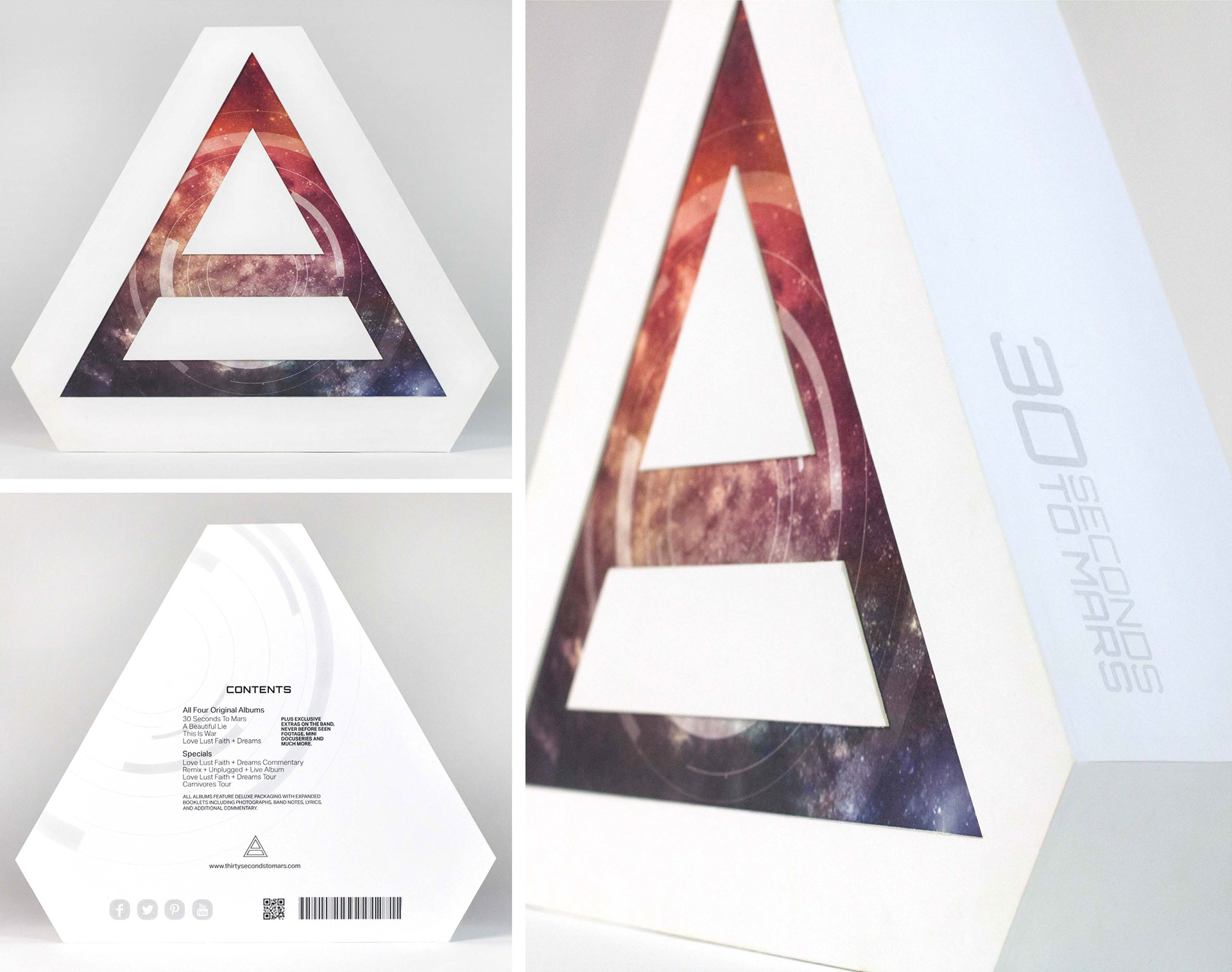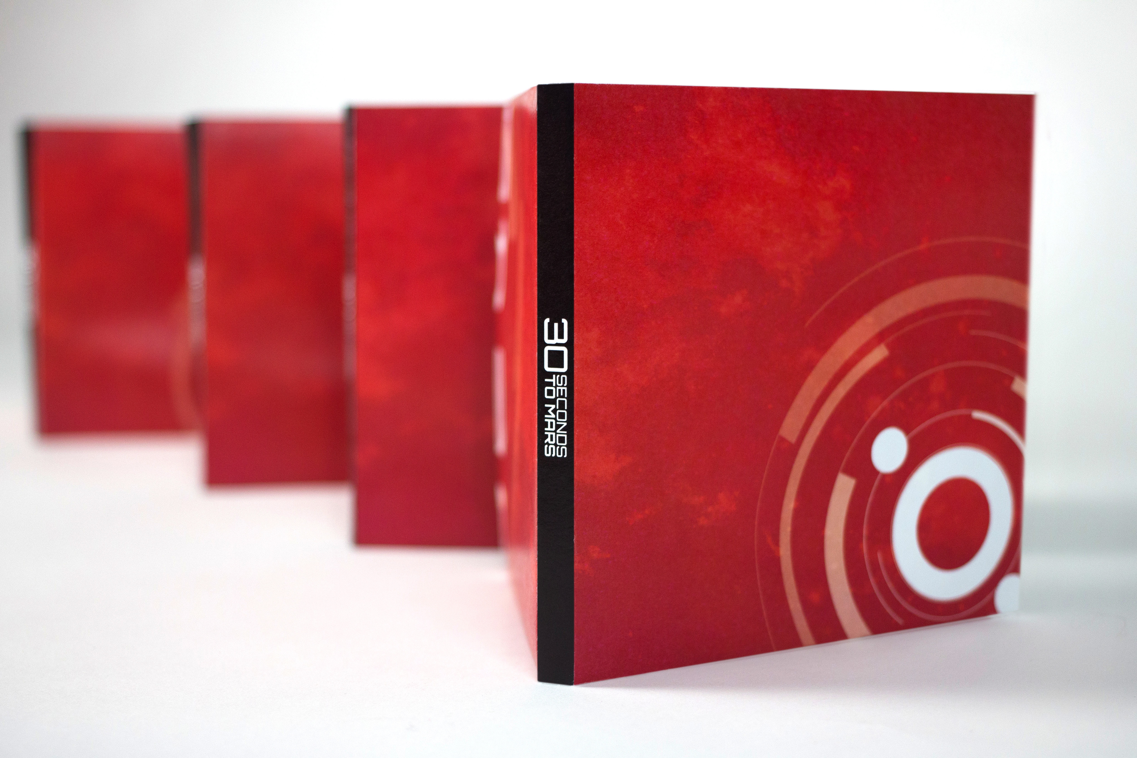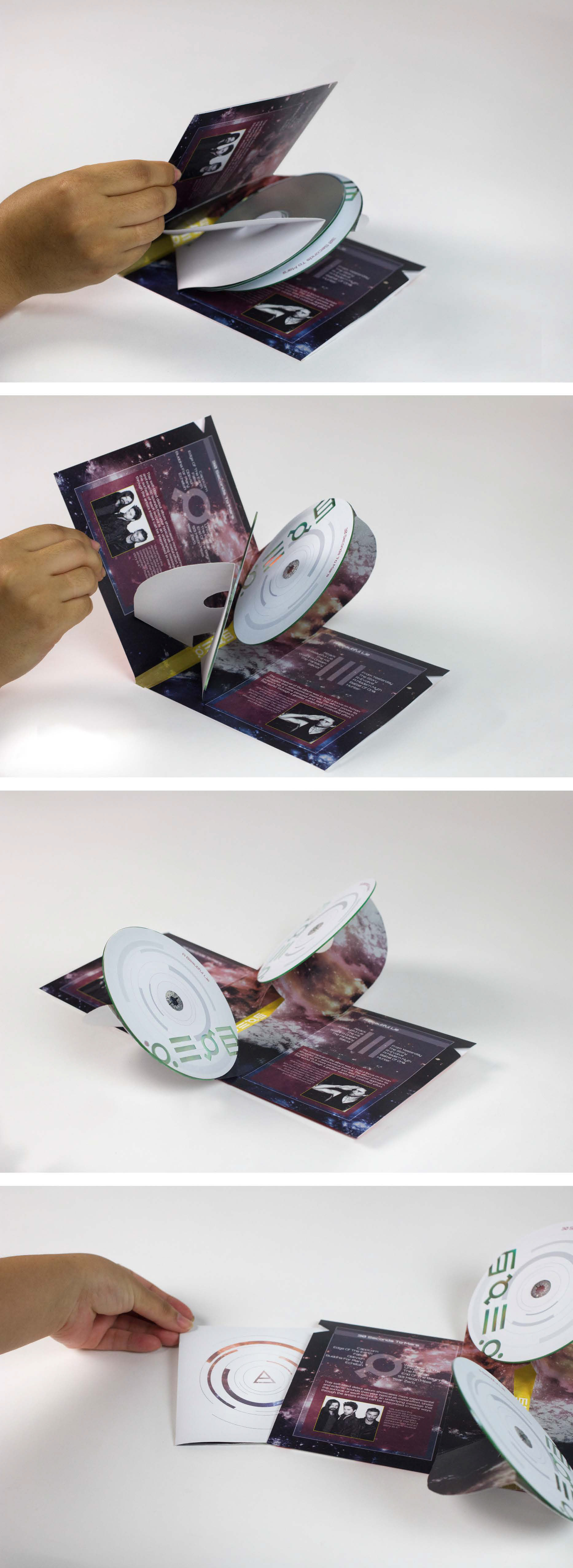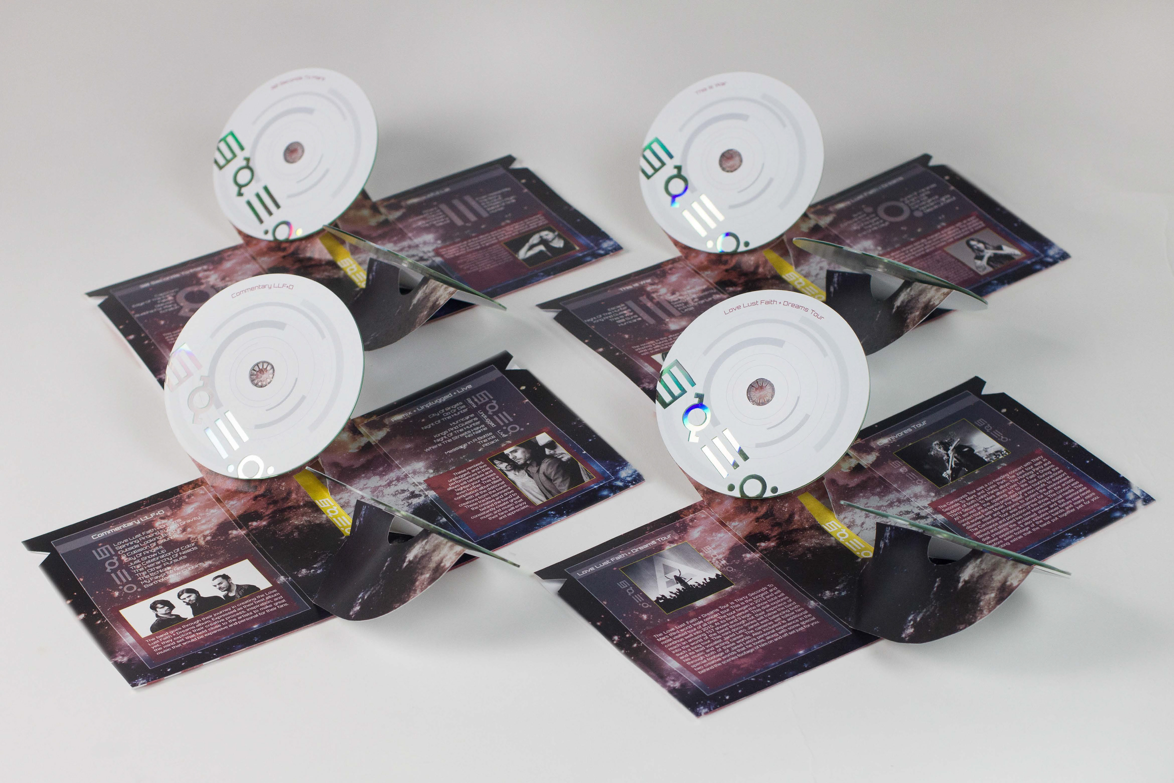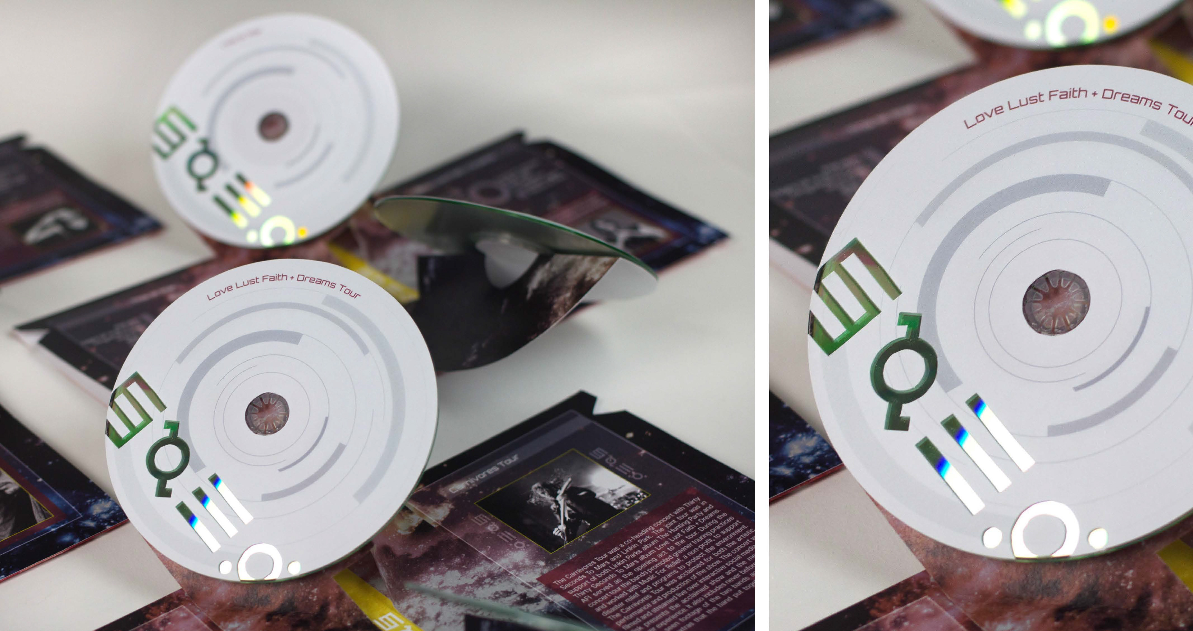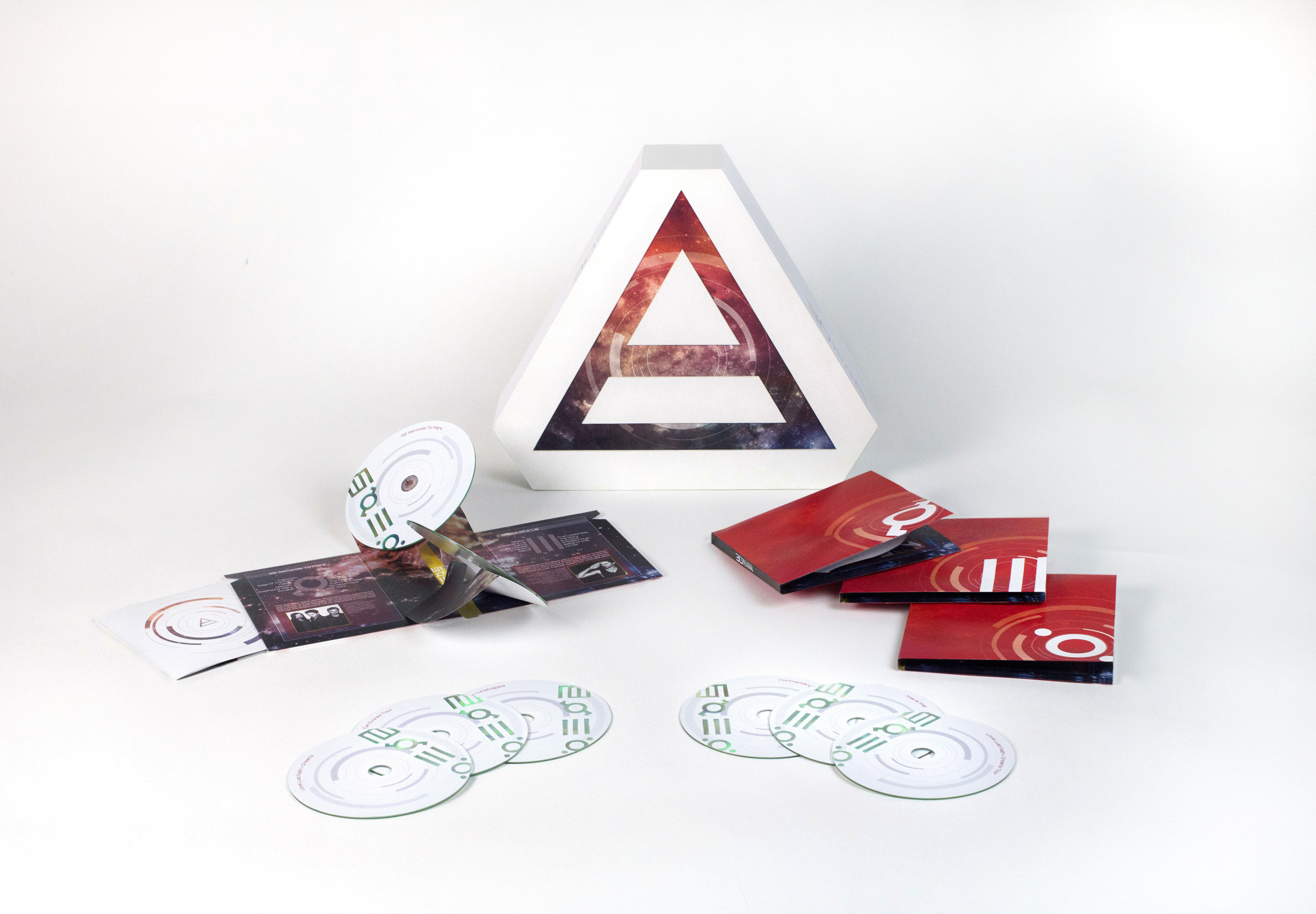
I wanted to create a dynamic experience with a modern design that highlighted the band’s dramatic musical style. The user experience is a revealing evolution reflecting the unique qualities of the band. It begins with the box’s clean triad design, the main symbol for the band. The box then reveals the stark red albums, a dramatic and unexpected contrast to the box packaging. The process of opening the albums contributes to the drama and interaction of the user experience with the pop up system and galactic design, again challenging the expectation of the packaging. The design of the CD's and booklet inserts are white to connect back to the box and tie the set together.